






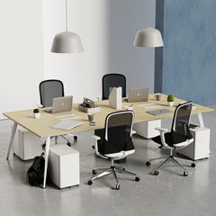
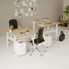
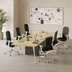


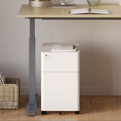


Filing Cabinet Choices for Cleaner Workstation Planning
Cleaner workstation planning starts with filing storage that matches the desk, document volume, security needs, and daily workflow. Explore how cab...
Learn more
Visit quiz page to see how we makes it easy to create an inspiring workplace


A monitor stand is often meant to improve a desk, not overwhelm it. Yet many setups end up looking tighter, heavier, and more cluttered after one is added. The problem is rarely the idea of elevating a screen. The problem is how that elevation is introduced into the workspace.
A desk can be technically organized and still feel crowded. That usually happens when the monitor area becomes too visually dense. Since the screen is the dominant object on most desks, anything placed directly under it carries extra influence. A thick riser, a deep shelf, a boxed storage base, or a cluster of accessories around the stand can make the entire workstation appear smaller than it is.
The cleanest setups do not rely on stacking more layers into the center of the desk. They respect sightlines, preserve usable surface area, and keep the visual weight of the workstation balanced. That is where many monitor stand choices go wrong.
The mistake usually begins with a simple assumption: if a stand adds structure, the desk will automatically look cleaner. In practice, the opposite can happen. A monitor stand adds another object to the most visually important part of the workstation, and that new object can either support the layout or interrupt it.
Physical clutter is easy to spot. It is the pile of papers, the loose charging cable, the scattered pens, or the accessories with no assigned place. Visual clutter is subtler. It comes from crowding the eye, not just crowding the surface. A desk can have only a few items on it and still feel cramped because those items are bulky, stacked, or poorly spaced.
A monitor stand often creates visual clutter when it breaks the surface line of the desk. Instead of seeing one calm plane with a screen rising from it, the eye sees a heavy platform, a shadowed storage area, and a raised center mass. That layered effect can make the desk feel compressed even if the actual square footage has not changed.
Most people visually read a workstation from the center outward. The monitor area becomes the focal point first, which means it sets the tone for everything around it. If the stand beneath the monitor is thick, wide, or busy, the desk feels crowded before the rest of the setup is even considered.
That is why proportion matters so much. A workspace built on adjustable ergonomic office desks can still look visually tight if the monitor support dominates the center of the surface. The desk may provide the foundation, but the monitor zone determines whether that foundation feels open or boxed in.
Some stands promise to create room by offering storage underneath. That sounds efficient, but the added shelf or platform often consumes more visual space than it gives back. Instead of opening the desk, it inserts another furniture layer between the user and the screen.
That extra layer can be especially disruptive on compact desks, where every inch of open surface matters. Once the middle of the desk looks heavier, everything else nearby starts to feel more crowded too.
Size mismatch is one of the fastest ways to make a desk look overfilled. Many stands are chosen according to general appeal rather than actual desk dimensions, monitor size, or work habits. The result is often a support piece that occupies far more visual and physical territory than the setup can comfortably carry.
A wide stand can force other essentials into awkward positions. Lamps get shifted into the corners, notebooks lose their natural resting space, and frequently used items end up on the edges of the desk. Even when the stand itself appears neat, it sets off a chain reaction that makes the whole surface feel crowded.
The problem is not just the width of the stand. It is what that width does to the composition of the desk. When every surrounding object is pushed outward, the workstation loses balance. Instead of looking intentional, it starts to look as though it is running out of room.
Depth can be even more harmful than width. A deep stand eats into the working zone where hands, keyboard, notebook, and daily tools naturally belong. People often notice this only after the stand is already in place, when writing space feels restricted and keyboard placement starts to feel compromised.
This issue becomes more pronounced when the desk is used for more than screen work. If the same surface needs to support planning, sketching, reviewing documents, or simply resting the forearms comfortably, a deep platform under the monitor can quietly make the desk much less functional.
A stand does not need a large footprint to look heavy. Thickness alone can make the setup feel dense. Chunky platforms cast stronger shadows, interrupt the horizontal line of the desktop, and visually divide the workstation into upper and lower bands.
That heaviness can become even more obvious when paired with lighting. A large riser plus a substantial lamp often creates too much competing mass in the same area. In those cases, choosing something more restrained like the Alumina Lamp alongside a visually lighter monitor solution can help the desk retain clarity rather than stacking bold forms in one zone.
A monitor stand is often purchased because the screen feels too low. That concern is real, but the solution is not always a shelf under the monitor. Sometimes the real need is not a platform but a different way of supporting the screen entirely.
A stand can improve viewing height and still worsen the desk. That is a crucial distinction. Better screen elevation is only one part of a healthy setup. The surrounding surface still needs to feel usable, calm, and visually coherent.
When the fix for monitor height adds bulk directly into the center of the desk, the workspace may become less comfortable overall. The screen might sit better, but the desktop becomes tighter, the keyboard sits farther forward, and the composition feels denser than before.
In many cases, a mounted monitor support creates a cleaner result than a riser because it removes the support load from the center of the desk. The Ergonomic Arm accessory is relevant in setups where the goal is not only elevation but also a more open working surface. Lifting the monitor off the desk plane can restore breathing room where it matters most.
This is especially useful on smaller desks, hybrid workstations, or setups where the same area is shared between screen work and hands-on tasks. Instead of introducing another platform, the desk regains continuity.
Many crowded desks come from solving the wrong problem with the wrong format. The question is not simply whether a monitor should be higher. The better question is where its support should exist. If the desk already feels visually full, adding another shelf to the center may solve posture while worsening everything else.
A support method that keeps the sightline cleaner often has a stronger overall impact than one that merely adds storage or height.
Storage under a monitor stand can feel practical at first. It seems like a sensible place for loose items that would otherwise sit on the surface. In reality, that area often becomes a catch-all zone for things that were never meant to stay in the visual center of the desk.
The shelf beneath a monitor tends to collect chargers, sticky notes, small devices, glasses, adapters, and spare office items. Even when these are partly hidden, they still create visual noise. The edges remain visible, the cords spill out, and the eye registers disorder in the middle of the setup.
What started as an effort to simplify the surface can end up creating a denser, more fragmented focal point.
The most effective desk layouts protect the area directly beneath the screen. That space should not behave like a storage cubby if the goal is openness. Storage is most useful when it removes distraction from the field of view, not when it concentrates it under the largest object on the desk.
That is why cable control works better below the desk than below the monitor. Using Under-Desk Cable Management is often a cleaner move than hiding cords under a stand, because it relocates visual noise away from the main working zone instead of simply compressing it into the center.
A common mistake is assuming that partially hidden items stop influencing the look of the desk. They do not. A messy cable loop, a stack of paper tucked halfway under a riser, or a charging hub peeking from beneath the stand still adds to the impression of crowding.
Clean desk design is not only about concealment. It is about keeping the focal zone calm enough that the eye can rest there without interruption.
Monitor stands rarely crowd a desk alone. More often, they become the base layer for additional styling choices. A lamp goes to one side, a tray goes to the other, a speaker slips under the shelf, and decorative objects fill the gaps. That is when the monitor area stops feeling functional and starts feeling overloaded.
Lighting is essential, but scale and placement matter. When a bulky stand is combined with another visually assertive piece, the desk can become top-heavy. Shapes compete, shadows overlap, and the center of the workstation starts to feel crowded from multiple directions.
This does not mean decorative lighting should be avoided. It means lighting should be chosen and placed with the same discipline as the monitor support itself.
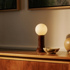
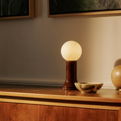
A refined lamp can still add too much if it is placed into an already dense monitor zone. The Shore Table Lamp fits naturally into a discussion about compact lighting because smaller table lamps can work well when the rest of the composition stays restrained. The issue is not the presence of a lamp. It is whether the lamp is being asked to coexist with an oversized stand, stacked storage, and several other accessories all in the same band of sight.
A well-styled desk does not need to showcase every possible add-on. Restraint is often what makes the layout feel considered. Browsing office furniture accessories can be useful when building a coordinated workspace, but the strongest results usually come from choosing fewer pieces with clearer roles rather than filling every remaining gap around the screen.
A calm setup leaves room between objects. That room is not wasted. It is what allows each piece to function without making the whole desk look busy.
A monitor stand is never judged in isolation. It is judged within the desk, the room, the nearby wall, the lighting conditions, and the distance from which the user sees it every day. That larger context often determines whether a support solution feels balanced or excessive.
In a compact room, heavy objects on the desktop appear more dominant. There is less surrounding space to soften them, and the eye notices crowding faster. A stand that might feel acceptable in a large open office can look intrusive in a tighter home workspace.
That is why proportion cannot be borrowed from inspiration photos without adjustment. Real-life working conditions matter more than staged images.
Choosing furniture and accessories works best when the whole layout is considered together. That includes the desk size, the monitor footprint, the lighting strategy, and the surrounding room. Exploring a showroom-quality office furniture selection online can help frame the workstation as a coordinated environment rather than a series of isolated product choices.
When that broader perspective is missing, the monitor stand often ends up carrying too much responsibility. It is asked to fix height, add storage, improve style, and organize clutter all at once. That is usually when it starts to overwhelm the desk.
The best alternative depends on the desk type, the size of the monitor, and how the surface is used each day. There is no single fix for every setup, but there are patterns that consistently lead to cleaner results.
| Desk Situation | Mistake That Creates Crowding | Better Direction | Why It Looks Cleaner |
|---|---|---|---|
| Small desk with one monitor | Wide shelf-style riser | Mounted monitor support | Frees the center surface |
| Desk with visible cords | Storing cables under the stand | Below-desk cable routing | Removes noise from the main sightline |
| Writing and screen work on the same desk | Deep monitor platform | Minimal support footprint | Preserves front working space |
| Styled home office | Pairing a bulky riser with multiple decor pieces | Fewer visual layers | Restores balance and spacing |
| Narrow desk in a compact room | Thick stand with storage cavity | Lighter, simpler monitor support | Reduces visual mass in the focal area |
1. Size the monitor support to the screen, not to imagined storage needs.
2. Keep the central sightline as open as possible.
3. Move cables and technical clutter below the desk whenever possible.
4. Avoid pairing a heavy stand with multiple bold accessories nearby.
5. Preserve empty surface area on purpose.
6. Judge every object by its footprint, height, thickness, and shadow, not just by function.
7. Treat visual calm and everyday usability as the same goal.
A monitor stand should help a desk breathe, not make it feel stacked and segmented. The most crowded-looking setups usually come from good intentions applied in the wrong way: too much width, too much depth, too much storage in the center, or too many accessories gathered around the same focal point.
A cleaner workstation comes from keeping the visual weight low, the sightlines open, and the desk surface continuous wherever possible. When the monitor area stays disciplined, the whole desk benefits. It feels larger, works better, and looks more considered without needing to hold less.


You have unlocked free shipping!
You're saving $29 and unlocked free shipping!
Leave a comment