


Filing Cabinet Choices for Cleaner Workstation Planning
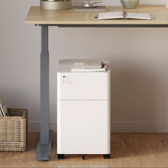
Cleaner workstation planning starts with filing storage that matches the desk, document volume, security needs, and daily workflow. Explore how cab...
Learn more
Visit quiz page to see how we makes it easy to create an inspiring workplace


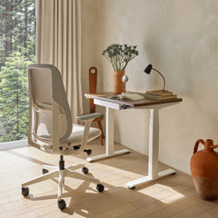
A bistro table can bring a home office to life in a way a conventional desk sometimes cannot. It feels lighter, less corporate, and more connected to the rest of the home. That advantage only holds, though, when the setup looks chosen. The difference between a refined workspace and a spare table with a laptop usually comes down to proportion, placement, lighting, seating, and restraint.
A round table has a naturally social shape, so in a work setting it needs visual cues that anchor it to focus and purpose. That means treating it as a compact workstation, not as a leftover dining surface. When the chair has presence, the lamp establishes function, and the styling is edited enough to preserve usable space, the whole arrangement starts to look intentional.
A bistro table works especially well when the room needs to feel like part workspace and part living environment. In apartments, guest rooms, bedrooms, and open-plan corners, a heavy desk can overstate the office function. A smaller round table softens the room and makes the work zone feel more integrated with the home.
That softer presence is not the same thing as being casual. In fact, the most successful bistro table offices feel deliberate because the table is chosen for a specific mode of work. Writing, laptop-based tasks, planning sessions, calls, and light creative work all fit naturally into this scale. A table like this compact bistro table for office and home is presented as a modern, compact, collaborative piece, which makes it a sensible foundation for a home office that values flexibility and a lighter visual footprint.
The design goal is not to make a bistro table imitate a large workstation. The goal is to let it succeed on its own terms. Once that mindset is clear, every other styling decision becomes easier.
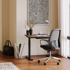
The first thing that makes a bistro table look intentional is where it sits in the room. A small table placed without context can feel temporary. The same table positioned near a window, framed by a rug, or anchored beside shelving starts to feel integrated.
Window-adjacent placement often works well because it gives the table a natural backdrop and a source of daylight that supports focused work. In a corner, the round top can soften sharp angles and make the office feel less cramped. In a shared room, placing the table where it aligns with other furniture lines helps it read as part of the overall composition instead of as an afterthought.
A common mistake is trying to fill every inch around a compact table. The empty space around it is part of the design. The chair needs room to pull back comfortably, and the eye needs room to recognize the table as a complete object. If the surrounding furniture presses in too tightly, the setup can start to look improvised.
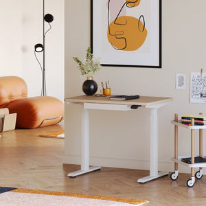
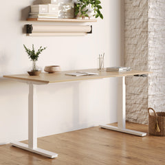
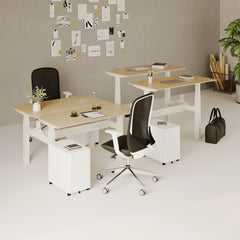
Not every room should be built around a bistro table. If the workday requires larger equipment, more storage, or a stronger ergonomic setup for prolonged use, a conventional desk may serve the room better. A collection of adjustable ergonomic office desks is specifically oriented around ergonomic office use, so it can be a more natural fit when function needs more surface area or structure than a bistro table can realistically provide.
Proportion is where intention becomes visible. Small-scale furniture can look elegant, but it can also look accidental when nearby pieces overwhelm it.
A bistro table in a room with bulky storage, oversized seating, or thick-legged furniture can disappear visually. The best results come when the surrounding pieces allow the table to feel present without needing to dominate. If the room already has visual weight from shelving, dark paint, or a large rug, the table should be supported with equally thoughtful companion pieces rather than decorative clutter.
The table, chair, lamp, and nearby storage should feel as though they belong to the same design conversation. A delicate table with a heavy task chair can look out of balance. A strong, sculptural chair with a tiny lamp can pull too much attention downward. Each element should support the others in silhouette, material, and scale.
The fastest ways to weaken the look are easy to spot once you know them:
A chair that visually outweighs the table
A lamp that consumes too much surface space
Decorative objects clustered in the center like a dining arrangement
A rug that is too small to define the area
Nearby furniture that makes the table seem like a spare piece rather than a central one
Good styling often looks effortless because the proportions have already done most of the work.
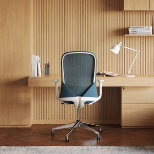
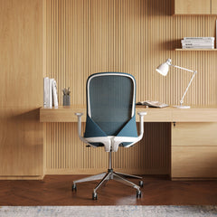
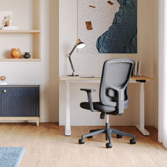
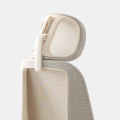
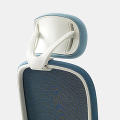
In a compact office, the chair often carries as much visual responsibility as the table itself. It can make the setup feel serious, polished, soft, creative, or unresolved.
A refined chair tells the eye that the table is meant for work. It also prevents the room from slipping into a café imitation. The best chairs for this kind of setup usually have enough structure to signal purpose, but not so much bulk that they overpower the round tabletop.
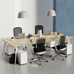
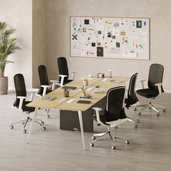
A collection of ergonomic office chairs is relevant here because the page is dedicated to ergonomic seating for office use, which supports the idea that comfort and visual clarity can coexist in a home setting.
In a softer room, upholstery and curved forms can create cohesion with textiles, drapery, and warm finishes. In a more architectural room, a cleaner chair profile can reinforce sharper lines and a more graphic palette. In a tight space, a visually lighter chair can keep the office from feeling crowded.
When a chair is uncomfortable, people compensate with folded blankets, spare cushions, or improvised support. Those additions often undermine the clean visual story of the workspace. A chair that is comfortable from the start protects both the function and the styling of the room.
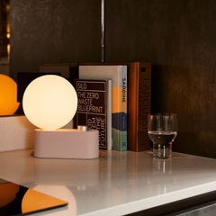
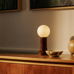
Overhead lighting alone rarely gives a small office enough intention. A dedicated lamp changes the meaning of the table. It introduces verticality, creates a focal point, and confirms that the surface is meant for focused use.
If the office leans minimal or architectural, a more sculptural fixture can carry a lot of the composition on its own. The multi-use LED table and wall light is described by the destination page as a multi-use LED light for table and wall applications, which makes it especially relevant when the goal is to give a compact workspace a sharper, more deliberate design edge.
If the room needs softness, texture, or a more residential mood, a gentler material expression can work better. The recycled glass table lamp destination centers on a Shore lamp made from recycled glass, so it fits naturally into a paragraph about adding warmth and visual softness without overstating the workspace. Place the lamp like part of a composition
The lamp should not sit in the exact center of the table. Offset placement usually feels more natural and preserves useful working room. It also allows the table to keep a sense of movement rather than feeling frozen. A lamp becomes even more effective when its finish or shape echoes another element nearby, such as a chair frame, cabinet pull, picture frame, or shelf bracket.
On a small round surface, height matters. A lamp gives the table a visual spine. Without that vertical element, the setup can look flat. With it, the workspace starts to register as a complete vignette rather than a bare tabletop.
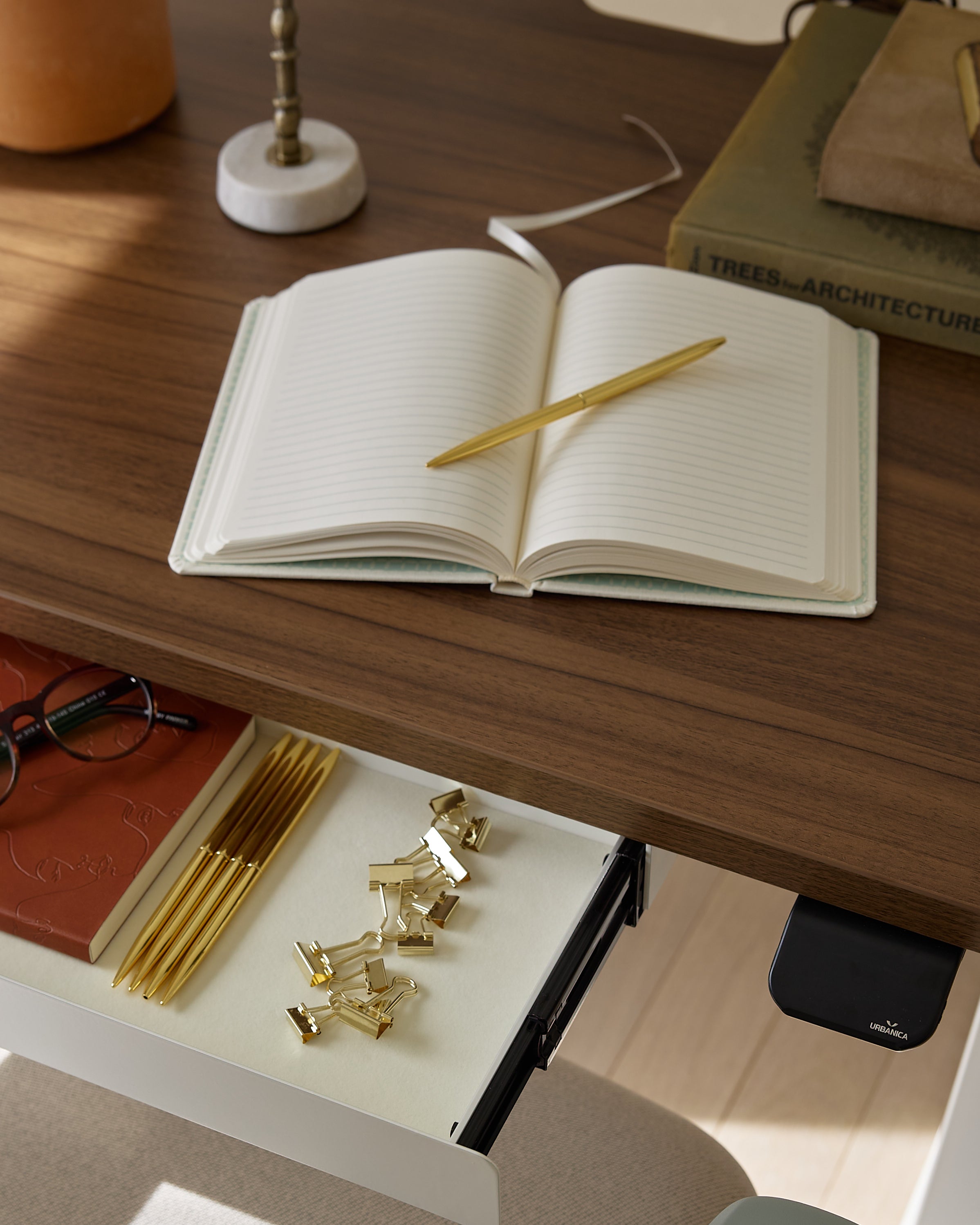
A bistro table fails in a home office when it looks styled for dining or social display. The most convincing setups use fewer objects, but choose them carefully.
A practical and visually balanced bistro table often includes only a few categories of objects:
1. A primary work tool such as a laptop or notebook
2. A dedicated light source
3. One restrained object that adds warmth or texture
4. Nothing extra unless it is used regularly
That formula keeps the table believable. It also protects the round top from becoming crowded, which is often what makes compact tables feel accidental.
This is where the actual work happens. It should remain the clearest and least obstructed part of the table.
This is usually handled by the lamp. It creates height and helps the table hold its own in the room.
This can be one small object with texture, form, or material contrast. It should support the room, not compete with the work surface.
A collection of modern office accessories can support this kind of styling because the destination is focused on office accessories rather than generic décor, which helps keep the setup aligned with the practical purpose of the room.
Small tables magnify clutter. A stack of papers, two charging cables, a water bottle, a tray, and a decorative object may not sound like much, but together they can erase the clarity of the setup. If an item does not improve either daily function or the room’s visual cohesion, it probably does not belong on the table.
Even a beautifully styled table can look isolated if the rest of the room does not support it. The space around the table should reinforce its function and mood.
Art, shelving, curtains, and wall color can all help define the table’s presence. A small office setup feels more finished when it has a visible boundary. That boundary does not need to be literal. It can simply be a shift in texture, an aligned piece of art, or a rug that clarifies where the workspace begins and ends.
If the table introduces warm wood, repeat warm wood somewhere nearby. If the chair base is black, let that finish appear elsewhere in the room in a restrained way. If the lamp brings in glass or a soft metallic note, let that material show up again through a secondary object or frame. Repetition is one of the simplest ways to make a small office feel resolved.
A broader planning page about modern ergonomic workspace solutions can fit this context because the destination is about modern and ergonomic office furniture, not just one city name, which makes it semantically useful in a paragraph about shaping a more complete and coherent work environment.
Once the fundamentals are in place, the room gains depth through finish choices rather than through more stuff.
A bistro table office tends to look strongest when the palette is narrow and intentional. Warm neutrals can create softness. Deep contrasts can sharpen the setup. Muted tones often help a work area feel calm and settled. What matters most is consistency. Too many unrelated colors can make the table seem disconnected from the room.
A restrained setup still needs tactile variation. Wood grain, upholstery, glass, linen, paper, and matte metal can all contribute richness without cluttering the space. Texture is especially important when the object count is low, because every finish becomes more visible.
A single round object in a room full of rectangles can feel misplaced. Repeating curves elsewhere helps the table feel native to the space. This can come through a chair back, a rounded lamp shape, a mirror, a vessel, or even softer textile lines. The repetition does not need to be obvious. Subtle echoes are often enough.
Different homes call for different expressions of the same idea. These three directions keep the bistro table feeling intentional while allowing for distinct moods.
| Styling direction | Chair character | Lighting approach | Surface styling | Best suited to |
|---|---|---|---|---|
| Soft modern | Upholstered, quiet, visually light | Warm and gentle | Minimal with one tactile accent | Bedrooms, calm apartment offices |
| Graphic modern | Clean-lined, crisp, architectural | Sculptural and defined | Highly edited | Contemporary corners, sharper interiors |
| Warm layered | Comfortable, textured, welcoming | Soft but grounded | Curated with restraint | Shared rooms, creative work zones |
This direction works well when the room already leans airy and understated. A gentle chair profile, limited color contrast, and softer lamp expression help the table feel serene rather than stark. The round form becomes part of a calm visual rhythm.
This approach suits interiors with stronger lines and more contrast. The bistro table can become a counterpoint to angular architecture, especially when the lamp has structure and the accessories are reduced to only what is necessary.
This is often the best route for mixed-use spaces. It allows the office to feel lived in without becoming messy. Texture matters most here. The challenge is to keep the layers disciplined enough that the table still looks like a workplace rather than an overflow surface.
An intentional workspace can lose its clarity quickly if it is not maintained. Small tables show disorder faster than large desks because there is less room for visual excess.
A reliable reset habit keeps the styling believable. Clear away cups and loose paper. Return tools to a single home. Realign the chair. Position the lamp neatly. Leave only one visible object that adds character. That small ritual helps the table hold its shape in the room from one day to the next.
The same principle applies when refreshing the office seasonally. Swap one accent rather than several. Keep the palette consistent. Avoid crowding the usable center of the table. Let function lead every update. A bistro table looks intentional when it continues to work well, not when it tries too hard to look styled.
A bistro table belongs in a home office when nothing around it feels random. The placement should make sense in the room. The proportions should feel balanced. The chair should add credibility. The lamp should establish purpose. The accessories should be edited enough to preserve space and clarity. The broader room should reinforce the same design language.
That is what makes the setup feel intentional. Not more décor, not more objects, and not a forced attempt to turn a small table into something it is not. A well-styled home office bistro table succeeds because it is compact, focused, visually coherent, and fully at ease in the room around it.


You have unlocked free shipping!
You're saving $29 and unlocked free shipping!
Leave a comment