


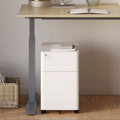


Filing Cabinet Choices for Cleaner Workstation Planning
Cleaner workstation planning starts with filing storage that matches the desk, document volume, security needs, and daily workflow. Explore how cab...
Learn more
Visit quiz page to see how we makes it easy to create an inspiring workplace


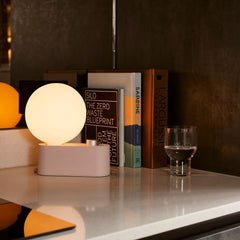
Color plays a bigger role in furniture choices than many people realize. It affects mood, focus, comfort, and even how long someone wants to stay in a space. While trends come and go, some furniture color combinations continue to work year after year because they feel balanced, calm, and familiar. Whether you are styling a home office or a shared workspace, the right color pairing can make furniture feel more inviting and easier to live with. This guide explains furniture color combinations that consistently work and why they remain reliable across different styles and settings.
Furniture is not just functional. It is part of the environment people interact with daily. When colors clash or feel overwhelming, the space can become tiring even if the furniture itself is comfortable. Consistent color pairings help the eye rest and allow the furniture to blend naturally into daily routines.
Neutral-based combinations with thoughtful accents are especially effective because they reduce visual stress. This makes furniture feel familiar instead of distracting. Over time, these choices create a sense of stability that helps people feel comfortable using the space every day.
Neutral colors form the base of many long-lasting furniture designs because they adapt easily to different rooms and lighting conditions.
Neutrals that work well with furniture include:
Soft whites
Warm beiges
Light to medium grays
Muted taupe
To keep neutral furniture from feeling flat:
Pair light neutrals with darker accents
Use texture to add depth
Balance warm and cool tones
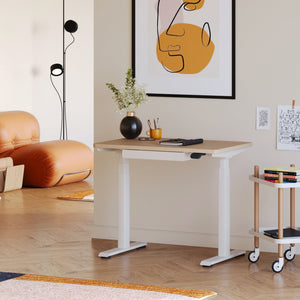
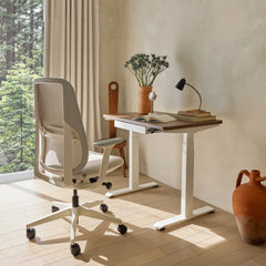
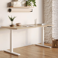
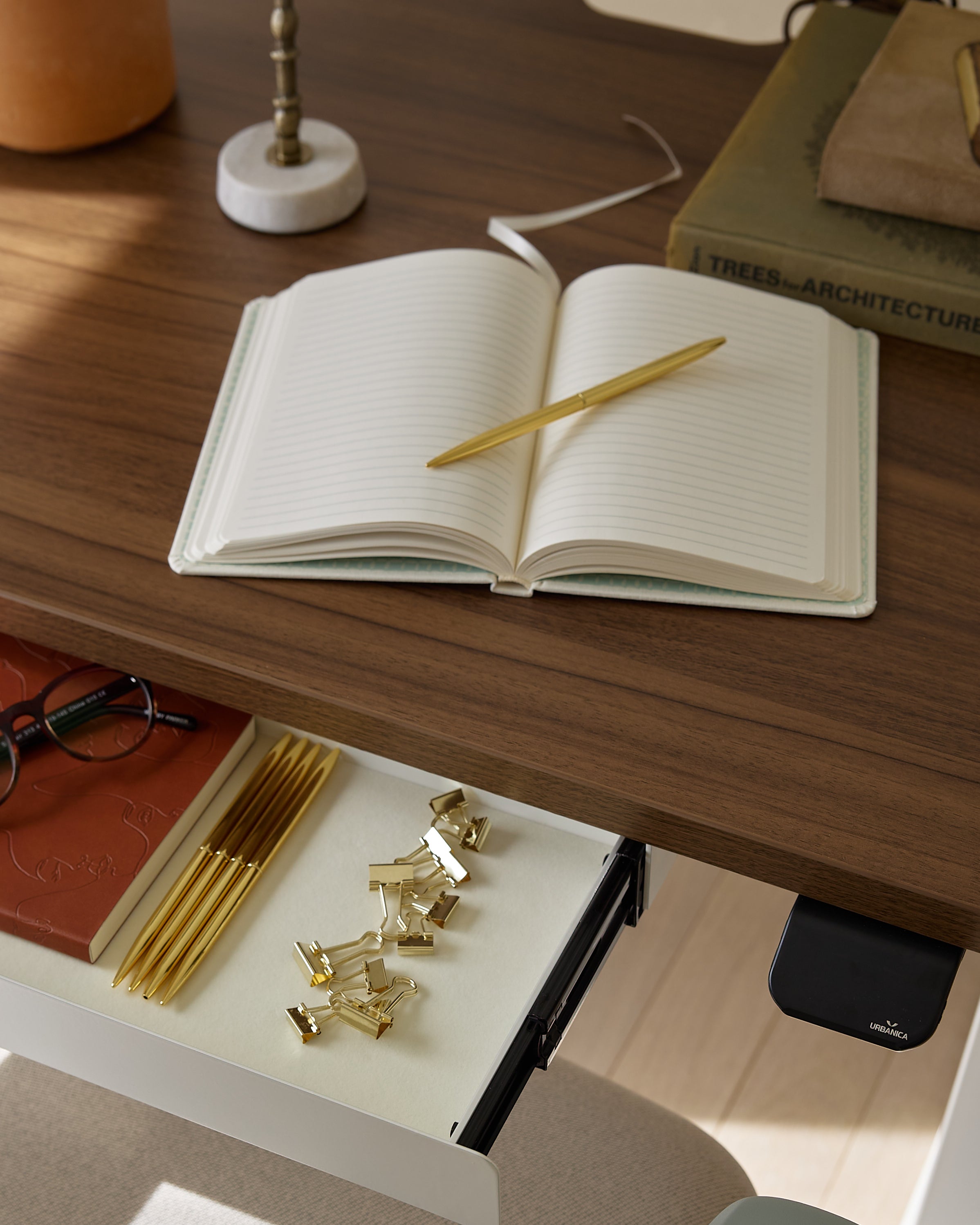
A height-adjustable desk in a neutral finish blends easily into different color schemes while maintaining a clean, grounded look.
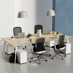
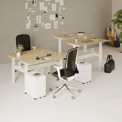
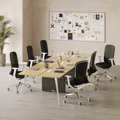
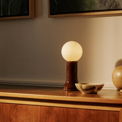
Black paired with natural wood remains one of the most dependable furniture color combinations.
Black adds structure, while wood introduces warmth. Together, they create balance without visual tension.
This pairing is effective in:
Home offices
Creative studios
Minimalist interiors
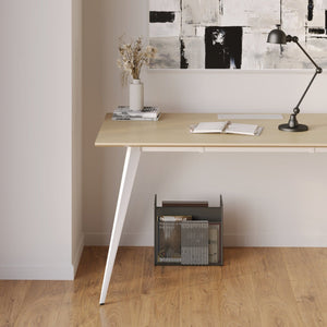
A solid work desk with natural wood tones combined with darker elements creates a space that feels both professional and welcoming.
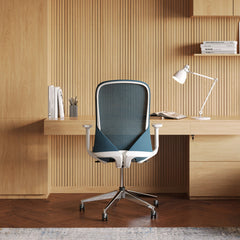
Gray furniture has remained popular because it sits comfortably between light and dark. When paired with warm accents such as beige, tan, or soft wood, gray feels calm rather than cold.
This combination works especially well in workspaces where focus is important. Gray reduces glare and visual noise, while warm accents prevent the space from feeling sterile or impersonal.
Earth tones consistently work because they reflect colors people naturally associate with calm environments.
Effective combinations include:
Brown and cream
Olive and soft gray
Sand and muted green
These colors:
Reduce visual fatigue
Create a grounded atmosphere
Pair easily with neutral furniture
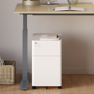
Furniture supported by guidelines on choosing ergonomic seating often uses these tones because they support long-term comfort and focus.
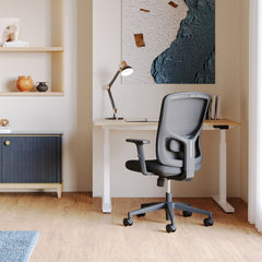
Using light and dark furniture together adds depth without clutter. This contrast helps define areas within a room, especially in open layouts.
For example, a light desk surface paired with darker seating creates a clear visual hierarchy. This makes the workspace feel intentional rather than scattered. Balanced contrast also helps furniture stand out without dominating the room.
|
Base Color |
Accent Color |
Why It Works |
Ideal Space |
|
White |
Natural wood |
Clean and warm |
Small rooms |
|
Gray |
Beige |
Calm and balanced |
Offices |
|
Black |
Light wood |
Structured yet inviting |
Modern spaces |
|
Brown |
Cream |
Soft and grounded |
Shared areas |
|
Taupe |
Charcoal |
Subtle contrast |
Home workspaces |
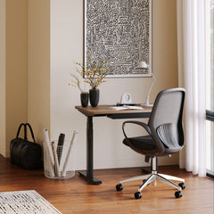
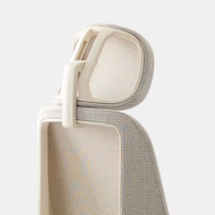
Seating often becomes the visual center of a workspace.
Colors that work in most environments include:
Black
Gray
Soft beige
Muted brown
Simple tones:
Match various desk finishes
Reduce visual clutter
Age well over time
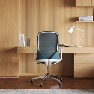
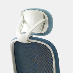
Adding adjustable arm support in a neutral shade enhances both comfort and visual consistency without drawing attention away from the overall color scheme.
Color affects how furniture feels just as much as shape or material. A chair in a harsh color can feel tiring, even if it is ergonomically sound. Soft, neutral tones help furniture fade into the background so the body can relax.
For those searching for a Los Angeles Ergonomic Chair, color often becomes the deciding factor after comfort. Neutral seating tones help the chair fit seamlessly into different interiors without needing constant updates.
Choosing furniture colors is not about following trends. It is about creating a space that feels comfortable every day. Reliable color combinations help furniture stay relevant, adaptable, and easy to live with.
Before finalizing your furniture colors, use this checklist:
Do the colors feel calming rather than distracting?
Will they still feel right after long-term use?
Do they work with natural and artificial light?
Can they adapt to future changes in decor?
Do they support comfort and focus?
When color choices support both function and feeling, furniture becomes part of a space people want to return to.


You have unlocked free shipping!
You're saving $29 and unlocked free shipping!
Leave a comment