


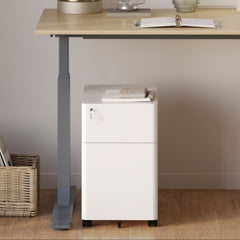


Filing Cabinet Choices for Cleaner Workstation Planning
Cleaner workstation planning starts with filing storage that matches the desk, document volume, security needs, and daily workflow. Explore how cab...
Learn more
Visit quiz page to see how we makes it easy to create an inspiring workplace


Bold colors and deep, rich woods add personality, warmth, and a sense of luxury to any room. These tones create visual depth, make spaces feel grounded, and bring character into areas that might otherwise feel flat or predictable. When used thoughtfully, vibrant hues and saturated finishes transform your home into a space that feels expressive and elevated. Whether you are refreshing one corner or redesigning an entire room, combining jewel tones and dark woods with the right furniture choices allows you to create a balanced, dramatic environment. This guide covers how to bring richness into your home using color, texture, contrast, and functional pieces that look beautiful while supporting everyday use.
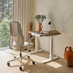
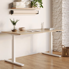
Your foundation piece helps define the mood of the space. A practical anchor like Office Furniture California gives you a stable starting point to build color richness around.
They keep dramatic tones grounded
They establish color direction
They stop the palette from becoming overwhelming
They add functional purpose
They support transitions into richer shades
Choose an anchor with a muted or deep undertone to give contrast and weight to brighter jewel tones.
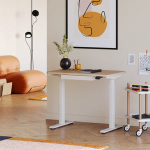
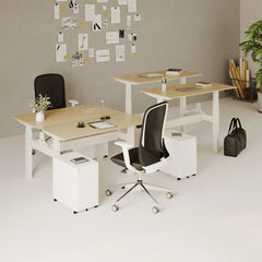
Vertical layering helps spread rich tones throughout the room so they don’t cluster in one area. A practical height element like a standing desk adds visual elevation and helps create balanced distribution of bold colors.
Helps intense shades breathe
Creates depth across multiple levels
Makes a small room feel more dynamic
Highlights darker wood grains
Allows color to move upward without overpowering the space
Place taller pieces in corners and layered items near the center to guide the eye naturally through the room.
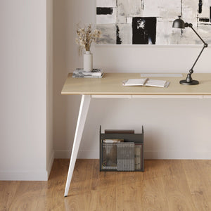
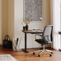
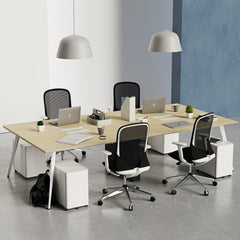
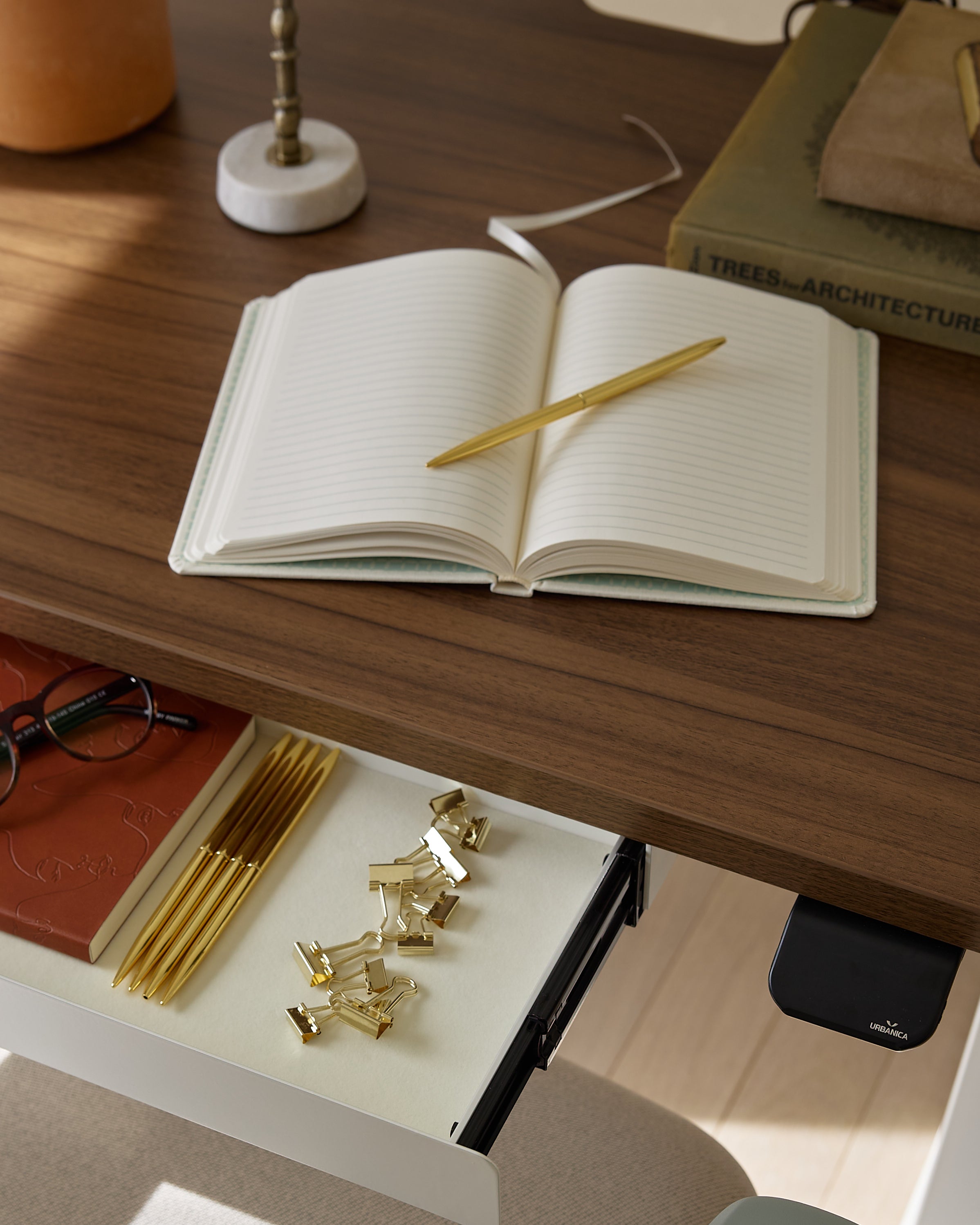
Your workspace surface influences how bold tones behave. A simple and structured surface like an office desk supports dramatic furniture and vivid accessories without adding visual clutter.
Clean lines to counterbalance heavy tones
Smooth surfaces that reflect light softly
Neutral or deep finishes
Minimal hardware to keep attention on color
Strong structure to support heavier décor pieces
Place bold items at varying heights on the desk to create movement while maintaining balance.
Environmental studies such as this brief ergonomic study highlight how surroundings influence comfort and focus. Strong color plays a similar role, influencing mood, energy, and visual comfort.
Deep blues and greens calm the mind
Rich reds and garnets energize
Dark woods offer grounding stability
Vibrant accents stimulate creativity
Balanced color placement encourages focus
Use intense hues in areas where you need energy and darker woods where you want stability.
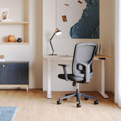
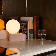
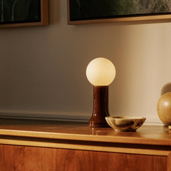
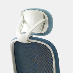
Accessories help tie bold palettes together without contributing to clutter. A supportive piece like an Ergonomic Arm introduces a subtle tone or texture that complements more intense colors.
Add balance between dramatic pieces
Prevent overstimulation
Offer soft transitions
Add comfort to high-use areas
Support daily function alongside aesthetics
Choose accessories in complementary jewel tones to strengthen your palette cohesion.
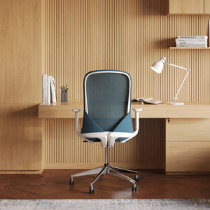
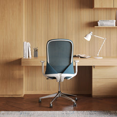
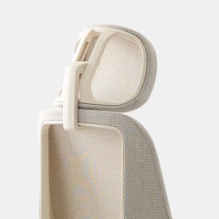
Seating influences how rich tones behave. A versatile piece such as a Seashell Chair introduces shape, texture, and warmth that deepen your color palette.
Offers a soft place for color contrast
Balances the energy of jewel tones
Adds texture that softens wood density
Guides how eyes move across the room
Enhances comfort with visual appeal
Pair richly colored seating with dark wood pieces to create a layered effect.

Jewel tones bring richness and elegance. Mixing them well creates a luxurious atmosphere that still feels inviting.
Emerald with navy
Garnet with charcoal
Sapphire with pearl-gray
Amethyst with muted beige
Ruby with warm walnut
Use one dominant jewel tone and let the others support it through small accents or secondary pieces.
|
Jewel Tone |
Wood Type |
Effect |
|
Emerald |
Walnut |
Rich and grounded |
|
Sapphire |
Black oak |
Dramatic and regal |
|
Ruby |
Mahogany |
Warm and bold |
|
Amethyst |
Ash wood |
Soft and modern |
|
Garnet |
Cherry wood |
Deep and classic |
Texture adds balance and keeps the space from feeling heavy. With dark woods and bold hues, texture introduces softness and dimension.
Soft velvet
Matte ceramic
Woven natural fibers
Smooth leather
Linen with light threading
Limit your texture palette to three main materials to avoid overwhelming the room.
Contrast helps bold colors stand out while preventing them from looking muddy. Strong contrast also highlights the richness of dark woods.
Pair light-colored textiles with dark wood
Add a single brightly patterned accent
Use metallics as balancing highlights
Introduce muted backdrops for intense tones
Use deep colors sparingly on large surfaces
Keep the brightest hues at eye level for the best visual effect.
Identify one dominant jewel tone
Choose complementary accents
Add grounding dark wood pieces
Keep textures balanced
Use gold or brass sparingly
Incorporate functional accessories
Keep lighting warm and soft
Leave some negative space
Anchor the room with one stable piece
Avoid overcrowding patterns
Bold colors and dark woods benefit from layered lighting. Good lighting enhances richness, softens intensity, and brings the entire palette forward.
Warm overhead lighting
Soft desk illumination
Directional spotlights for art
Low side lamps for ambience
Natural light to brighten darker tones
Use multiple light sources at different heights to create a glowy, layered mood.

Bold colors and deep woods bring life, mood, and character into your home. When used intentionally, they transform ordinary rooms into expressive and grounded spaces. With the right mix of jewel tones, supportive textures, and functional furniture, you can build an environment that feels sophisticated yet warm. Rich palettes should energize you while supporting comfort, helping you create a home filled with depth and personality.


You have unlocked free shipping!
You're saving $29 and unlocked free shipping!
Leave a comment