


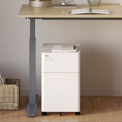


Filing Cabinet Choices for Cleaner Workstation Planning
Cleaner workstation planning starts with filing storage that matches the desk, document volume, security needs, and daily workflow. Explore how cab...
Learn more
Visit quiz page to see how we makes it easy to create an inspiring workplace


Color affects how a room feels, moves, and speaks. It can soften a space, energize it, or establish a quiet confidence through subtle undertones. When used thoughtfully in furniture design, color becomes more than decoration. It becomes a method for shaping mood, creating visual drama, and establishing flow. Tonal and contrasting pieces influence how the eye travels through a room, how furniture relationships form, and how each item interacts with surrounding textures. This guide explores how you can use color theory in furniture to elevate your space and style with intention.
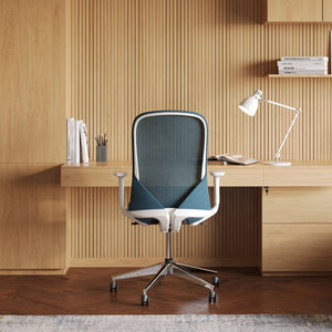
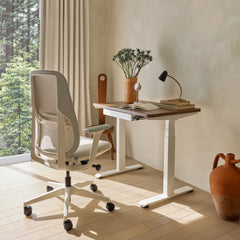
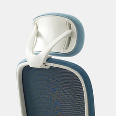
Every color story begins with an anchor piece. Whether you lean toward warm neutrals or bold contrasts, choosing one reliable foundation ensures your palette stays cohesive. A supportive seating piece like a Los Angeles Office Chair grounds your setup while offering comfort and presence.
Establishes the base tone for the palette
Guides how other colors behave in the room
Helps unify textures and finishes
Influences lighting interactions
Sets emotional tone and overall mood
Pick a hue that reflects how you want the space to feel. Neutral bases provide flexibility. Dark tones add weight. Light tones open the space visually.
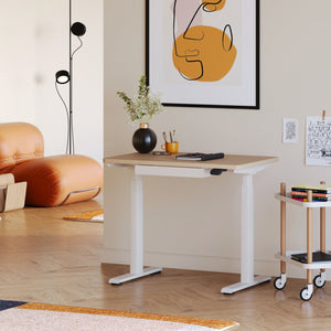
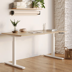
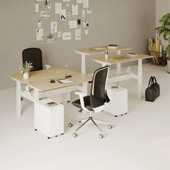
Height influences how color is perceived. A multi-level setup, especially with pieces like a standing desk, creates visual rhythm in the room. It also allows contrasting furniture hues to complement one another through vertical layering.
Enhances visibility of accent colors
Adds depth to small rooms
Creates dimension and movement
Allows subtle tones to shine
Draws attention to color relationships
Mix low seating with taller surfaces. This creates a dynamic setting that allows different shades to interact rather than blend too quickly.
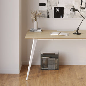
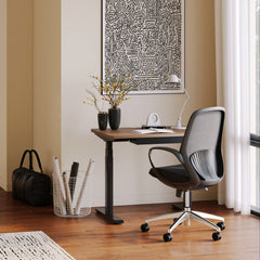
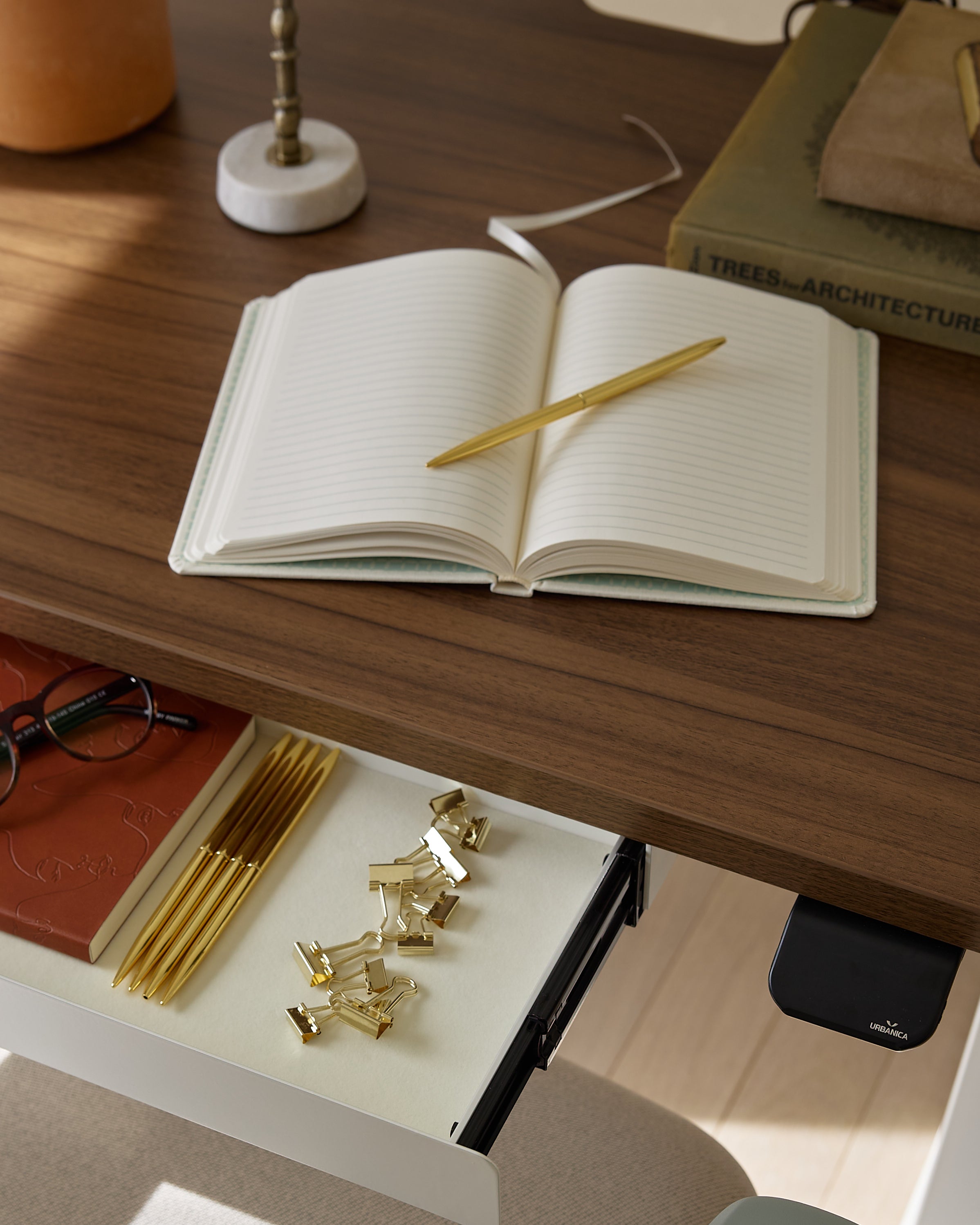
Your workspace surface plays a major role in color balance. Choosing a functional and structured piece like an office desk allows you to build harmonious tones around a central color.
Lighter desks make bright accents pop
Darker desks stabilize vivid contrasts
Mid-tone surfaces pair well with warm or cool palettes
Matte finishes soften bright elements
Gloss finishes intensify color reflections
Use a desk shade that ties two distant colors together in your palette. Mid-tones often act as visual bridges.
Color theory goes hand in hand with minimalism. As highlighted in this short minimalism study, removing unnecessary elements allows color to speak more clearly. By simplifying, you let tone, shade, and contrast become the emotional drivers of your room.
A controlled palette strengthens visual harmony
Fewer pieces make contrasts more powerful
Clean lines highlight subtle tonal shifts
Neutral bases allow accent colors to shine
Soft contrasts bring depth without clutter
Choose two dominant tones and one accent shade. This keeps the palette consistent while still visually dramatic.
Sometimes small details reinforce your color direction. A supportive accessory like an Ergonomic Arm can help spread your palette through subtle, functional touches without overwhelming the room.
Adds secondary tones for balance
Helps transition between contrasting shades
Keeps color story unified across functions
Allows consistency without excess decoration
Softens bold color combinations
Place supportive colors to frame the main anchor piece without overpowering it.

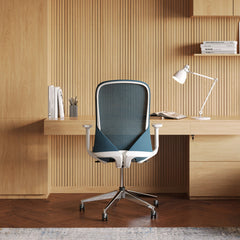
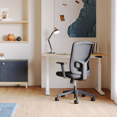
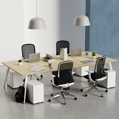
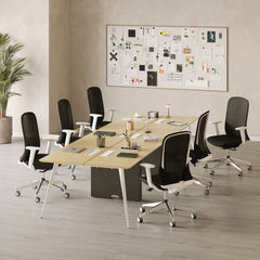
Seating contributes heavily to your palette’s personality. A supportive and visually stable office chair becomes the link between your workspace surfaces, accent décor, and storage features.
Contrasting chairs create focal points
Tonal chairs create calm flow
Muted finishes add sophistication
Gloss finishes add playful drama
Upholstered textures influence color warmth
Match your chair to the undertone of your desk or contrast it intentionally to create visual emphasis.
Contrast is one of the strongest tools in color theory. Using opposite tones, intentional brightness differences, and structured color groupings enhances the room’s energy and adds emotional storytelling to your furniture layout.
Light vs. dark
Warm vs. cool
Matte vs. glossy
Soft texture vs. structured finish
Neutral base vs. bold accent
Use contrast sparingly. Aim for one or two powerful contrast moments per room to avoid overwhelm.
|
Approach |
Description |
Best Use |
|
Tonal palette |
Similar shades and undertones |
Calm, cohesive spaces |
|
High contrast |
Opposite colors for drama |
Focal points and bold rooms |
|
Low contrast |
Soft differences |
Subtle depth |
|
Mixed palette |
Combination of tones |
Flexible, layered rooms |
|
Neutral base |
Base of grays or beiges |
Transitional styles |
Color behaves differently depending on its surroundings. The layout, distance between pieces, and lighting all influence how tones appear in your space.
Soft wall colors that highlight accent pieces
Flooring that relates to furniture undertones
Textures that reinforce tonal layers
Lighting that warms or cools dominant hues
Spacing that lets colors breathe
Warm lighting deepens earthy tones. Cool lighting sharpens modern palettes.
Define your room’s purpose
Choose one main anchor tone
Decide where you want contrast
Evaluate natural lighting direction
Match undertones across major pieces
Test colors against your wall shade
Consider flooring and rug tones
Check how textures affect color mood
Choose accents that reinforce balance
Avoid mixing too many competing shades
Texture plays a major role in how color feels. Smooth textures amplify color vibrancy. Rough textures soften hues. By combining both, you can enhance mood and create layers without needing extra decorative pieces.
Woven fabrics soften strong tones
Leather enhances warmth and richness
Matte surfaces absorb light for a calm look
Glass and metal sharpen cooler palettes
Plush textiles add comfort to neutral tones
If your palette feels too bold, add textured neutrals to soften the overall impact.
Color gets stronger when paired with intentional shapes. Rounded silhouettes soften intense hues, while straight lines add structure to subtle tones.
Curved shapes create calming transitions
Angular pieces intensify strong contrasts
Simple silhouettes highlight tonal palettes
Layered shapes guide visual movement
Balanced mix creates harmonious flow
Use curved pieces near bold colors to balance drama with softness.

Color theory becomes a powerful tool when you apply it intentionally. Tonal harmony sets a relaxing foundation, while contrasting pieces add energy and personality. When you understand how furniture colors interact with shape, height, texture, and surrounding elements, you can build a space that feels expressive and grounded. With the right palette direction, your furniture becomes more than functional. It turns into a storytelling element that brings depth, clarity, and visual drama into your home.


You have unlocked free shipping!
You're saving $29 and unlocked free shipping!
Leave a comment