


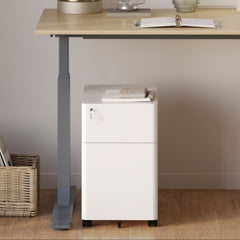


Filing Cabinet Choices for Cleaner Workstation Planning
Cleaner workstation planning starts with filing storage that matches the desk, document volume, security needs, and daily workflow. Explore how cab...
Learn more
Visit quiz page to see how we makes it easy to create an inspiring workplace


Color is one of the most underestimated productivity tools in a workspace. Long before you sit down, open a laptop, or begin a task, your surroundings have already started shaping your mental state. The colors around you influence how alert you feel, how long you can concentrate, and how quickly stress builds throughout the day.
In small or multi-purpose workspaces, this effect becomes even stronger. Limited space means every surface, material, and finish sits closer to your visual field. When colors compete for attention, the brain works harder just to stay balanced. When they work together, focus feels natural and energy lasts longer without effort.
This article explores how color psychology works specifically in workspaces and how furniture choices amplify or neutralize its effects. Rather than chasing trends, the goal is to create an environment that supports clarity, consistency, and sustainable productivity.
Color affects the nervous system faster than conscious thought. Certain shades lower heart rate and calm the mind, while others stimulate alertness and physical energy. In a workspace, these effects compound over hours of use.
Bright or highly saturated colors can feel energizing at first but often lead to faster mental fatigue. The brain constantly processes contrast, brightness, and movement, which drains cognitive resources. This is why some people feel inexplicably exhausted by midday even when their workload has not increased.
Subtle, balanced color palettes reduce that invisible cognitive load. They allow attention to stay on tasks rather than constantly recalibrating to visual input.
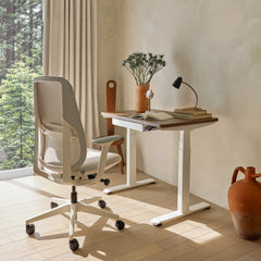
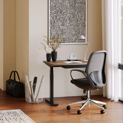
Neutral colors are not boring. They are stabilizing. Shades like soft gray, warm beige, muted taupe, and light wood tones create visual predictability, which helps the brain conserve energy.
• Reduce visual noise
• Minimize glare under artificial lighting
• Adapt well to changing daylight
• Support long focus sessions
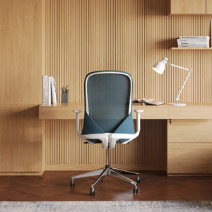
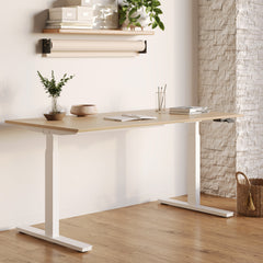
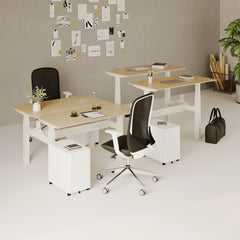
Large furniture pieces dominate visual space. Choosing a neutral Office Desk California finish keeps attention on work rather than on the desk itself, especially in compact rooms where surfaces sit close to the eyes.
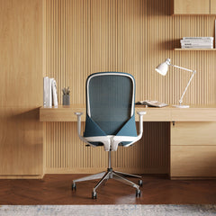
Accent colors should function like punctuation, not headlines. Their role is to guide the eye gently and create visual rhythm without overwhelming the senses.
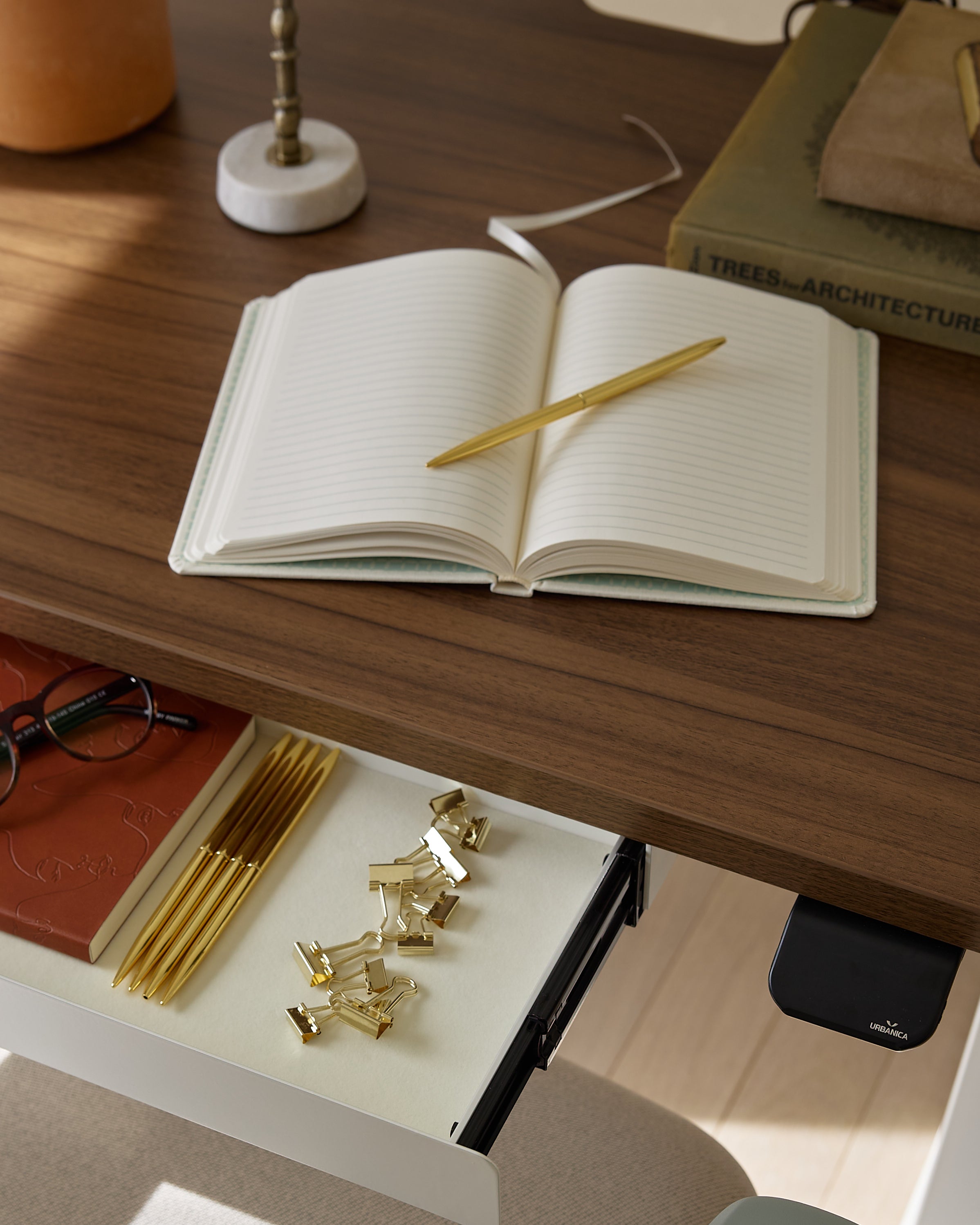
• Desk accessories
• Chair details
• Shelving behind peripheral vision
Large saturated surfaces near screens or across multiple furniture pieces create constant stimulation. Over time, this increases mental tension rather than motivation.

Movement is a core part of sustained productivity. When posture changes throughout the day, color consistency helps maintain mental continuity.
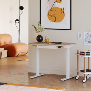
An adjustable Mini Standing Desk Los Angeles paired with a calm color palette allows seamless transitions between sitting and standing. The body moves, but the environment stays visually stable, which reduces cognitive disruption.
The space directly behind and around your screen plays a critical role in eye strain and mental endurance.
• Low contrast behind screens
• Matte finishes over glossy ones
• Muted colors at eye level
Pairing proper color balance with an ergonomic workstation setup reduces neck strain, eye fatigue, and tension headaches during long sessions.
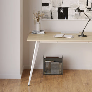
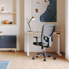
Texture adds depth without visual chaos. Matte wood grain, fabric upholstery, and soft-touch surfaces absorb light and soften visual transitions.
A textured office desk finish helps maintain warmth and comfort while preventing reflections that distract attention.
|
Base Tone |
Accent Tone |
Ideal Use |
|
Soft gray |
Muted blue |
Analytical tasks |
|
Warm beige |
Olive green |
Long sitting sessions |
|
Light oak |
Charcoal |
Balanced focus |
|
Cream |
Clay |
Creative work |
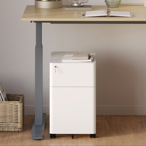
Accessories should enhance workflow while remaining visually quiet.
• Match finishes to desk tones
• Avoid glossy black near screens
• Keep metal finishes consistent
A neutral monitor mount frees desk space while keeping screens aligned and visually balanced.
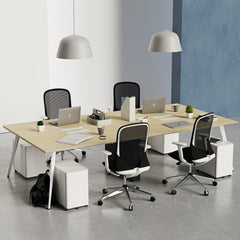
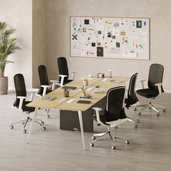
Seating takes up significant visual space. Loud colors increase stimulation, which can feel energizing briefly but lead to faster fatigue.
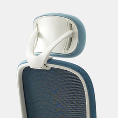
A balanced-tone office chair supports posture while keeping the workspace visually grounded and calm.
Light changes color perception. Warm lighting can make cool tones feel dull, while harsh lighting exaggerates contrast.
Furniture finishes that remain neutral under different lighting conditions help maintain consistency throughout the day, reducing visual fatigue.
In small rooms, restraint matters more than creativity. Limiting the palette to two or three core tones prevents visual clutter and supports clarity.
Consistent furniture finishes make small spaces feel cohesive rather than crowded.
Visual order creates psychological safety. When the environment feels predictable, the mind relaxes and focus improves.
Color consistency across furniture reduces subconscious stress responses linked to visual chaos.
Trendy colors often age poorly. Neutral, grounded palettes support long-term use without visual fatigue, making them better investments for daily work environments.
Color psychology works best when paired with intentional furniture choices. Together, they reduce friction between environment and effort.

The most productive workspaces do not demand attention. They quietly support it.
☐ Neutral base furniture
☐ Limited accent colors
☐ Matte finishes near screens
☐ Consistent tones across pieces
☐ Texture instead of contrast
When color supports function, productivity feels effortless rather than forced.


You have unlocked free shipping!
You're saving $29 and unlocked free shipping!
Leave a comment