


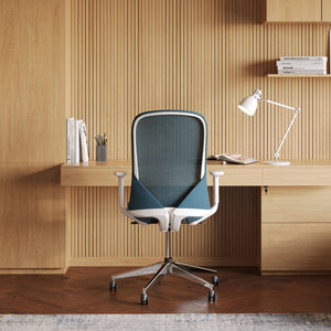


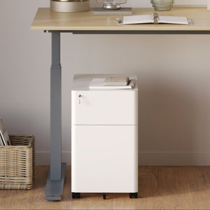


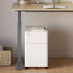


Filing Cabinet Choices for Cleaner Workstation Planning
Cleaner workstation planning starts with filing storage that matches the desk, document volume, security needs, and daily workflow. Explore how cab...
Learn more
Visit quiz page to see how we makes it easy to create an inspiring workplace

 Many people assume a small room is already equivalent to a cramped space, but the strategic placement of a desk can effectively trick the eye, optimize flow, and allow a workspace to feel open and breathable. This article presents layout strategies informed by real-world dimensions and ergonomic logic, complete with product ideas that maximize spatial harmony, regardless of room size.
A well-chosen desk layout does more than merely "fit"—it fundamentally alters the psychological experience of being in the room. The identical physical footprint can feel tight or airy depending on several key factors:
Movement paths and circulation flow.
Visual sightlines and unobstructed views.
Negative space (areas left intentionally empty).
Furniture proportions and visual weight.
Psychological studies of workspace design consistently indicate that clear fields of view, opportunities for visual breaks, and unobstructed sightlines reduce cognitive "clutter," which, in turn, contributes to lower stress levels. Furthermore, ergonomics research emphasizes that sufficient access space around the desk—essential for moving, reaching, and turning—is just as important as the desk dimensions themselves. With clever layout tweaks, even a compact room can retain full functionality and a sense of openness.
Below are three distinct layout templates proven to work across various room shapes. Selecting the optimal version depends on the specific geometry and function of your floor plan.
|
Layout Style |
Best Room Shape |
Key Advantage |
Potential Challenge |
|
Floating / Central |
Square rooms, minimal furniture |
Desk becomes a visual centerpiece with circulation all around |
Requires more walking room on all sides |
|
Wall-mounted / Back-to-wall |
Narrow rooms, corridor setups |
Maximizes open floor space in front |
May feel “closed in” if walls are excessively cluttered |
|
Corner / L-shape |
Rooms with unused corner zones |
Frees up the center space and enables multi-task zones |
Requires balanced placement so one wing does not visually dominate |
We will detail each layout, including implementation advice and aligning product options that complement its design philosophy.
This configuration positions the desk away from the walls—either centered or offset—allowing movement and circulation around at least two or three sides. The desk is transformed into a free-floating element rather than being anchored to a boundary.
The central desk placement intrinsically promotes a feeling of expansiveness:
Sightlines extend past the desk, as surrounding furniture is not visually blocked by the table structure.
Paths flow easily around the desk, offering motion flexibility.
Visual balance is achieved, particularly when decor or lighting is symmetrically arranged.
Leave 80–100 cm (≈ 32–40 in) of clearance on all primary circulation sides where feasible.
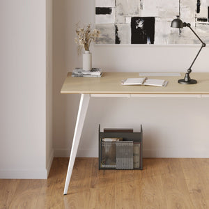
To minimize visual weight, select desks with minimal or slender leg styles (e.g., hairpin or trestle).
For power management, route cables under a low channel or through a floor grommet, especially if wall outlets are centralized.
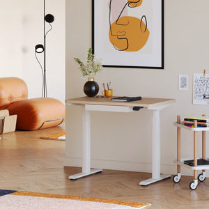
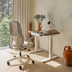
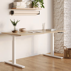
An adjustable standing table works exceptionally well here, offering the flexibility to move around and dynamically adjust distance to walls without creating visual bulk. This layout is best suited for mid-sized rooms (e.g., 3m × 3.5m and up), though offsetting the desk slightly toward a long wall can make it work in tighter spaces, avoiding obstruction near entry doors.
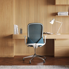
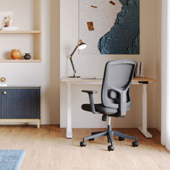
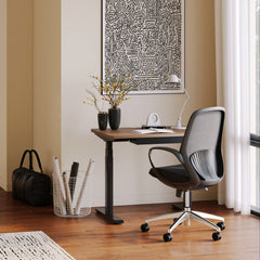
In this setup, the desk sits flush against one wall, immediately creating a large, clear expanse of open floor ahead. The wall behind serves as a consolidated support zone for power, lighting, and shelving.
This method is highly effective for maximizing usable floor space:
The layout reclaims more open center floor area.
Furniture and decor placed on the opposite walls can balance the room without visual conflict.
The wall above the desk can support rail systems, pegboards, or wall-mounted shelving without interfering with walking paths.
Maintain 90–120 cm (≈ 35–47 in) of open space in front of the desk for comfortable chair movement.
Utilize a desk with a modest depth (60–70 cm) to prevent it from protruding excessively into the room.
The chair should be able to tuck fully under the desk when not in use to preserve the circulation path.
Keep the wall opposite the desk clutter-free to enhance the "breathing" effect and spatial perspective.
A clean, more minimalistic desk fits beautifully here because its slim profile avoids creating a bulky "wall of furniture" look. Even in compact rooms, this layout feels spacious if the opposite wall or the main entry path remains uncluttered.

This configuration involves placing the desk to form an 'L' shape or a spoke extending into a corner. This naturally creates two distinct functional wings: one for computer work and another for writing, reference materials, or physical tasks.
The L-shape efficiently utilizes often-awkward corner zones:
The center of the room remains completely free and open.
The setup allows for two distinct work zones without requiring two separate tables.
Visual complexity is concentrated on two walls, leaving the rest of the room feeling more open.
Assign wings intelligently: typically, the shorter wing for the monitor and the wider wing for spread-out tasks (e.g., blueprints, sketching).
Balance the L-shape with wall decor or lighting on the opposite side to prevent one wing from visually dominating the room.
Avoid using long runs of drawers that might obstruct leg movement or turning.
Employ a swivel chair so that you rotate between wings rather than having to walk.
This layout is particularly beneficial in irregular rooms or those with multiple doorways, as it allows one leg of the desk to be tucked into an otherwise unusable space. A properly sized Office Table Arkansas can be specified to perfectly match the necessary wing dimensions for this layout.
Ergonomic comfort should never be sacrificed solely for the sake of achieving more apparent "space." Layout planning must integrate established ergonomic guidelines to ensure long-term well-being.
Referencing established guidelines, always keep the following in mind:
Monitor Position: The screen should be positioned about an arm’s length away, with the top one-third aligning slightly below eye level.
Reach Zones: Keep frequently used items within "primary reach" (approximately 45 cm lateral) to eliminate constant twisting and strain.
Legroom: Ensure at least 60 cm width by 45 cm height of clear space beneath the desk.
Adjustability: Maintain the ability to assume various positions (sitting, standing, resting), ideally facilitated by a sit-stand desk mechanism.
Lighting Control: Strategically position the desk relative to windows and lights to prevent glare, removing the necessity to frequently shift the desk position.
Ergonomics forms the silent backbone behind work space layouts that prevent physical discomfort even after extended working hours. Unobstructed movement around the desk is a key component of this.
The principles of thoughtful desk layout are consistently reinforced across adjacent professional fields, confirming that design intention is paramount.
A university ergonomics resource breaks down the 10 steps for designing a human-friendly workspace, many of which hinge not merely on desk dimensions but specifically on clearance, reach, and unobstructed movement pathways.
Furthermore, studies in architectural and industrial design outline how office spaces must actively manage circulation zones, maintain functional adjacency (e.g., placing a printer near the desk), and control furniture density to preserve "breathing room." These sources collectively reinforce the notion that no amount of stylish furniture can effectively compensate for inadequate layout planning.
To illustrate practical application, let's consider a hypothetical compact room measuring 3 m × 3.5 m (with a ceiling height of 2.6 m). The following footnotes and steps guide layout selection:
The approach requires matching the desk style and placement to the primary function of the room.
Scenario A: Focus on Screen Work + Light Writing.
Layout Choice: Back-to-wall layout with a desk sized 140 cm × 65 cm.
Key Action: Leave 100 cm in front as the main walking zone. Use one side wall for a pegboard or a slim shelf unit.
Scenario B: Alternating Sit-Stand with Occasional Spread Tasks.
Layout Choice: Floating layout with a 160 cm width desk.
Key Action: Leave approximately 80 cm of free space on all circulation sides. Use a sit-stand desk to enable posture rotation. Employ minimal legs and route cables under the floor to maintain clean sightlines.
Scenario C: Need for Two Zones (Computer + Writing) in a Narrow Floor Plan.
Layout Choice: Corner layout with wing sizes, for example, 120 cm + 80 cm.
Key Action: Ensure the chair allows for easy spin or pivot instead of full walking movement. Keep the diagonal corridor clear for door access.
In all scenarios, careful attention must be paid to ensure the layout never obstructs the door swing, window opening, or necessary electrical outlet access.

A room achieves a feeling of spaciousness not through mere emptiness, but through intention. Intentional layout planning provides breathing room, balances movement, and respects crucial ergonomic requirements. Whether you choose to float your desk, position it against the wall, or angle it into a corner, your choice shapes not only the physical room—but also the quality of your workday experience.


You have unlocked free shipping!
You're saving $29 and unlocked free shipping!
Leave a comment